Tuesday, January 15, 2013

New site for my pinhole photographs

Sunrise Over Hernandez, Laura Brent

As a way to streamline the viewing of my pinhole photographs, I have created a new website.
Visit laurabrent.org to see them in all their glory.  Please take a look and let me know what you think.

Saturday, December 8, 2012

Leaping into the not so certain future...

Photographs by Laura Brent
Last night's closing reception of SKY HIGH was a successful ending to an enjoyable exhibition, although a tad bittersweet. The three month exhibition netted me my best sales period in the history of the gallery. The cloud photographing continues, however, as I plan to continue this documentary project for an entire year, capturing all seasons of skies, to complete the project of cataloging these transient objects. The future form the work may take is undetermined, but will offer opportunities for a reappearance in the future.

So what is next for Valhall Arts? This is a question that is a bit up in the air. The past status quo changed a few months ago with the sale of the historic Post Office building to a new owner. Luckily this means that many of the 'ten year past their useful life' mechanical HVAC units in the building are going to be replaced. A much need upgrade of the building will occur, and I hope this creates a new liveliness. How these changes will affect the spirit of the building remains to be seen.

There has been lighthearted talk of 'ghosts' in the building, and the entire Oak Street plaza area was once a graveyard, home to civil war casualties and honored soldiers. (although the bodies were probably moved...more research needed.*) Could it be the tainted soil which is beneath us that causes the lackluster energy? or is it the stagnant art community that pervades the area? Of the several artists that rent spaces in the building, some have decided to use this change as an impetus to move on to new adventures. Others are still debating what to do, considering possible studio trades, and/or re-locations within the building. The trouble of finding a concrete solution is compounded by the lack of information coming from the new landlords. There is gossip about other non-art tenants coming in, (possibly a restaurant), rent raises, and proposed remodeling.  It is hard to make a decision without all the facts, so I am in a 'wait and see' period of stagnation.

All this instability in the structure of my work space has distracted me from really creating any quality substantial work. I have been playing in the darkroom a bit, making photo-grams, and printing some older shots, but it has been far too long since I have used my pinhole cameras and I am lacking a clear direction of where I want my work to go. In the forefront, at this time, must be the marketing of my recent projects to other galleries in major art cities.(Santa Fe, NYC, Chicago, LA) Although I am grateful for the 2% of my local audience that appreciates my work,  I must expand my audience to reach more of those who it is intended for, the 'literati' of contemporary art, as it may be. As such, Valhall Arts, the gallery, will take a back seat. What the new year holds will be determined when it gets here.

*planning a trip to the new Fort Collins Museum of Discovery historic archive!

Tuesday, October 2, 2012

SKY HIGH


SKY HIGH ~ Artist's reception December 7, 2012, 6-9 pm

“The clouds were there for everyone.” -Alfred Stieglitz

“The photo can optically replace its object to a certain degree. This takes on special meaning if the object cannot be preserved.” –Bernd and Hilla Becher


SKY HIGH is an exhibition about beauty. The presentation is a typology of skyscapes. The photographs, a catalogue of our skies, document the variety of shapes, forms, colors, and textures, seen in the clouds above us. Each viewer sees a unique picture, the personal experiences and histories affecting the truth of what the viewer sees. The collection, and its presentation, is founded on historical precedents.

The subject of clouds was much studied by one of photography’s, and American Modernism’s, pioneer, Alfred Stieglitz.  His series, ‘Equivalents”, was produced later in his career, (most were made between 1925-1935) and were purely lyrical abstractions, intended to function evocatively, to elicit emotions in the viewer. The photograph is a metaphor, the cloud shown in the picture, is more than the ‘thing’ pictured, but primarily a ‘function’, a device, to generate a feeling in the viewer. (Equivalence: The Perennial Trend. Minor White, PSA Journal, Vol. 29, No. 7, pp. 17-21, 1963)

1923. Gelatin silver print, 4 5/8 x 3 5/8" (11.8 x 9.2 cm). Alfred Stieglitz Collection. Gift of Georgia O'Keeffe. Held in collection at The Museum of Modern Art, New York


Bernd and Hilla Becher were married German photographers who catalogued the existence of many industrial buildings, and other architecturally interesting structures, and presented them in the grid form. Their motivation was to create an historical record of this "nomadic architecture which had a comparatively short life -maybe 100 years, often less, then they disappear. It seemed important to keep them in some way and photography seemed the most appropriate way to do that." (quote by Bernd Becher)

Bernd and Hilla Becker, Installation view

What is more transient than the ever-changing vista above our heads? How often are you aware of the beauty above? If we take the time to look, the beauty is there for everyone. Remember to notice, and do not lose this treasure, the ability to find beauty.

Exhibition featured at Valhall Arts, please visit the website for more details. 

Soundscapes selected by Chris Reider,  ambient sounds and experimental music, all part of creative commons, and free for anyone.

Photograph by Laura Brent, 2012


SKY HIGH, 28 Photographs by Laura Brent, installation view

Tuesday, September 4, 2012

Clouds, Stieglitz and O'Keeffe

Over the last few months, I have been working on a new digital project, photographing clouds, evocative of Alfred Stieglitz's "Equivalents". At first, when I saw these Stieglitz photographs, I did not find them as interesting as his earlier works. They seemed so empty of any 'big' ideas, and I thought perhaps they were byproducts of his advanced age, an indication that he was going 'soft in the head' producing these saccharine images. With more research however, I discovered that his motivation for this project was a desire to do something 'hard', to test his knowledge and mastery of photography. They were first presented in 1923 as "Music: a sequence of 10 cloud photographs", later "Songs of the Sky", and in 1925 he started to use the term "Equivalents".  Stieglitz stated that these pictures were the equivalent of certain human emotions, documents of eternal relationships, perhaps even philosophies. They were lyrical abstractions and he would turn or flip them as needed in their presentation to express the emotion he was portraying. He went on to say that essentially, all his photographs were 'equivalents'.
Alfred Stieglitz: Equivalent (Set H, Print 1), 1923; gelatin silver print; 4 5/8 x 3 5/8 in.; San Francisco Museum of Modern Art, Alfred Stieglitz Collection

I have come to see them as expressions of his happiness, passion and love for/with Georgia O'Keeffe. There has been much discussion on this famous art world love story, and I firmly believe that O'Keeffe, with her sensual relation to the natural world, impacted him to move his work in this direction.  There is a particular painting of hers that was produced around the same time as these photographs by Stieglitz, and the similarities are striking.

A Celebration, 1924. Oil on canvas. Georgia O'Keeffe American, 1887-1986 34 7/8 x 18 in. (88.6 x 45.7 cm) 36 1/4 x 19 3/8 (92.1 x 49.2 cm)  in the permenant collection of Seattle Art Museum

Alfred Stieglitz, Equivalent, 1924 - 192
"I was told yesterday that I seemed to be faraway all the time yet seemingly in contact with all that's here. I had to laugh. When one is playing with the clouds & one's best part is far so faraway - near the endless sea - one cannot be entirely amongst those who know little about clouds - little about sea - "

" - I still continue to learn - There is so much to learn. - Not in the ordinary sense - not the knowledge talked of & which it is said one should have - but a learning about something which very few seem to know much about - "

Alfred Stieglitz, in a letter to Georgia O'Keeffe, (Lake George, NY, September 25, 1923)

From "My Faraway One", Selected Letters of Georgia O'Keeffe and Alfred Stieglitz, Volume 1, 1915-1933, edited by Sarah Greenough, Yale University Press, 2011.

Other references: "Equivalence: The Perennial Trend", Minor White, PSA Journal, Vol. 29, No. 7, pp. 17-21, 1963

Thursday, May 31, 2012

The Mystery Project


Object, by Laura Brent. Wood cup lined with velvet on typewritten card. 2012
I just completed another Art House Co-op project, (My seventh! I love these guys, so inspiring!) called The Mystery Project, where I created an artwork to be left in a public space to be found by a stranger.  Again, this was an inspiring project and really got me thinking on my art making, the objects I create (or not, as the case may be, as a conceptualist), and my audience.

I was sent a kit with supplies to guide me in my creation. Included was a 'theme' and a free Canary Yellow Prismacolor fine art marker. My theme, "Things and the people and places using them" was fairly wide open, and became my main inspiration, as I am often thinking on objects in relation to my art making and how one assigns meaning and value to objects. The marker, with two differently sized, flexible tips, while nice and bold, was fairly uninspiring. The color did not 'pop' for me, and drawing is more of a private activity for me, one that I use in working out my ideas, but that is not my finest skill, and not the primary material presented in my artwork.


Thinking conceptually, I considered what would be considered a pinnacle object in our contemporary society. A cell phone or computer? Which object carries with it the most significance? Did I want to choose some obscure object, or something common to all? I continually kept coming back to Meret Oppenheimer and her Object, having seen it in person at the MoMA.

Object, Meret Oppenheim, 1936
Here was a common object, a cup, altered in such a way as to make it unusable, offering a commentary on how we perceive objects we use and come in contact with every day. By adding the foreign materials, the useful object become useless, converted to art, a surreal object with a higher purpose.

This was what I wanted to create. The cup signifies a communal meeting, an object used to nourish our bodies, and something common at social gatherings.  Using found materials, I altered a wooden cup, lining it with red velvet, and it became something else, a unique special object - art.

I felt badly not following the rules designated for the project, but it was also stated that the work  could take any form, so I went ahead with it.  Expecting the work to be generally misunderstood, (see the previous posts regarding my audience...) I decided to leave it in one of Fort Collins' best coffee house/book stores, The Bean Cycle/Matter Books, hoping that the person who encountered it there would have a basic knowledge of contemporary art, or at least a curiosity to explore. (i.e. book lovers.) The colorful title of the book pictured nearby was the impetus for my final choice of location.

My Mystery Project, installed in its location, near the art & photography books.

The work's reception is a mystery to me. I will never know who sees it, who takes it home as their own, and how it is perceived. But this is part of the adventure of art making, putting one's work out in the world, it is no longer mine, and the public can do with it what they may. It was not easy to leave, as I was quickly becoming attached to it, as I enjoyed its tactile beauty. But, I slyly set it upon the shelf, pretending to look at books, unnoticed by the few folks working nearby on their computers.  Perhaps it may still be there when I return one day. If not, I hope it finds a place where it is appreciated and enjoyed, as I did its creation.
Another view of the work.

Detail of typewritten card.

Wednesday, May 23, 2012

Duchamp, nothing and an already made artwork

Every summer, I take time off from the gallery life, and take a sabatical from the exhibitions at Valhall Arts.  Instead, I leave behind something for my visitors to see.  Something that is nothing.

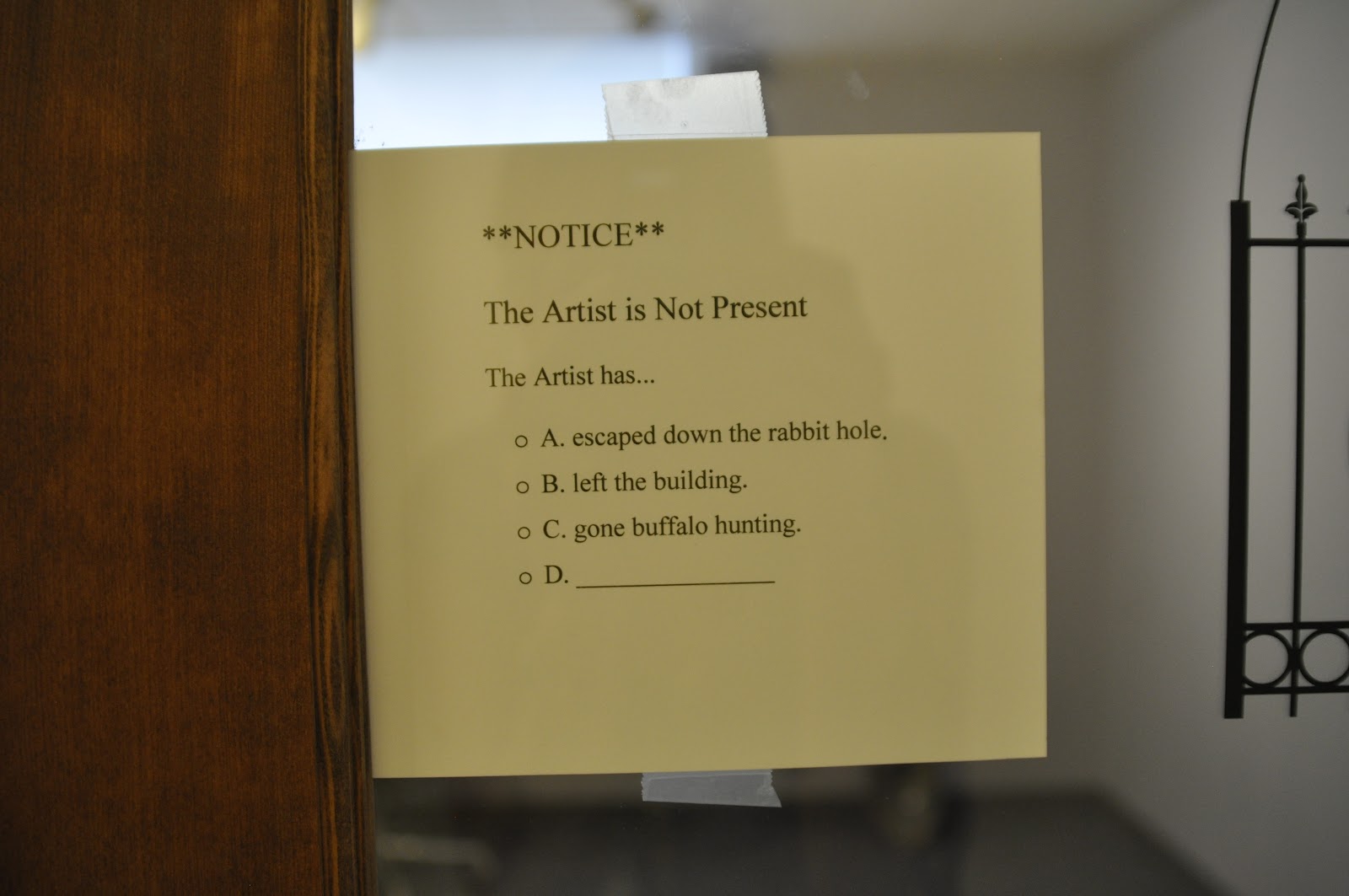
Last summer it was an installed hole in the ground, dug in the middle of the gallery, an obvious falsity, (and Andy Goldsworthy reference)


I presented it as a joke, but also a truth.  The title, The Artist is not Present, was a direct reference to Marina Abramovic's performance (that I went to see) at the MoMA, and the shovel left in the space as a nod to Marcel Duchamp (specifically his "In Advance of the Broken arm"). The multiple choice question didactic was a way to playfully engage the audience, while dropping clues to some of my favorite popular cultural ephemera, as well as a statement of my feelings toward the reception of my artwork by my local audience. It's a construction of an environment, one that the audience was excluded from (only able to look through the window in the closed and locked door), using common objects, symbols, and cliched ideas.

This year I have installed something along this vein, however at the this point in my work, I have reached a state of utter disregard for my local audience. I feel like after the 4 years that Valhall Arts has been open, I have taken them as far as they are willing to go in regards to viewing and thinking about contemporary art. Their responses are baffling and frustrating, and mind blowing in their ineptitude. I am instead focusing on my ideas, my work, and marketing it to a broader audience, beyond my neighborhood, hopefully for viewers who care to take the time to understand it. This situation could be considered a brief re-enactment, an homage of sorts, to Duchamp and his behavior at the end of his career when he stated that he was no longer going to make any more art, and instead, just play chess. (Image below is Duchamp's window display for Andre Breton's  Arcane 17 at the Gotham Book Mart, 1945)


Time would reveal that this was a sort of performance art in itself, as Duchamp was busy for many years creating his final grand artistic gesture. (The creation of Etant donnes -- link via ToutFait.com, is to an animation by Robert Slawinski, and involves the five following unaltered works by Duchamp in the order in which they are listed below:

Window Display for Andre Breton's Le Surrealisme et la Peinture, 1945
Given: Maria, the Waterfall, and the Illuminating Gas, 1947
Study for Given: 1. The Waterfall / 2. The Illuminating Gas, 1947
The Illuminating Gas and the Waterfall, 1948-49
Given: 1. The Waterfall / 2. The Illuminating Gas, 1946-1966)

I want to leave my audience to wonder where I've gone, as I go out into the world to enjoy all it has to offer. I leave them only a tiny clue, easily overlooked, a QR code to scan, itself a bizarre object unique to our contemporary digital culture. I wave a fond farewell, as I bid them  to "piss off!".  To those curious few who make the effort (and have the smart phone ability) to scan the code, a surprise. See what it will bring? Yep, "Nothing Here."


Tuesday, April 10, 2012

Giving it all away!


My new installation is a very subtle and complex work of art. Many who visited the opening were confused and did not understand the meanings in the work. It was very common for people to rush in and out, only spending a short time looking at the installation. There was often a lack of serious consideration given to the artwork, rarely was any time taken to just experience the environment, taking in the entire installation, absorbing the myriad of sensory stimuli in the space. I was often asked, “What’s it about?” as the visitor just wanted the quick answer, for me to simply tell them my ideas. To do that would defeat the making of the art, the delivery of my ideas through beautiful environments. When I create an installation, I compose the entire environment, directing the visitor’s experience, so it is somewhat disrespectful when a visitor does not take the time to actually look at what I’ve done. Why are you here? I do not understand this mentality, this lack of attention. I assume these are folks out on the First Friday Art Walk, so they must be interested in art. They may just be unfamiliar with, or unaware of, how to look at art. It appears that there is a lack of motivation to investigate, to explore, engage and enjoy strange or confusing artworks. Where is the creative curiosity? Perhaps a person’s ego is bruised by this confusion, experiencing a feeling of stupidity because they do not understand, and this puts them off. But, do not make the mistake of confusing the subtlety of the work as some high brow, over intellectualized “art-speak”.  My ideas behind the work are persistent human emotions, issues and conditions common to all, and if the viewer would only take the time to experience the work, in its entirety, they would arrive at the answers themselves. Any work of art, will, of course, always be an individual experience, so my ideas are not necessarily the ones the viewer will arrive at, but once an installation is truly experienced, the messages and emotions and thoughts created in the viewer become valid as well. Being in the west, in the lesser populated heartland of our country, there is a bit of a disconnect with the rest of the contemporary art scene found in major cities (NYC, LA, Chicago), so the reactions of my public does not surprise me. It is confounding though. (I will digress here no further, for more discussions see other &/ future posts.) So, to aid in the reception of my work, I will explain it, in an attempt to educate my audience, and perhaps, some will be intrigued enough to want to see it (again).

Moving Pictures, Take Two
Meditations, 2012

 The space is small, sparsely furnished, with minimalistic objects and sensory stimuli. There is an intimate feel of an alter space, with the dramatic black curtains on each side of a white cloth panel in which the short film is playing in a loop. The white cloth cascades out into the small room in a wrinkled watery stroke. A small battery operated candle flickers artificially in the middle of this ‘stream of cloth’. The edges are defined with two white ‘columns’, haphazardly leaning against the walls. Opposite the video is a sterling silver necklace with a baby shoe charm, and upon further inspection, it is revealed to contain the artist’s blood. This small object is lit with a spotlight to accentuate its importance in the installation, its placement opposite the video purposefully used to contrast the ready made object with the created object. There is also a small table with a simple tin tray with bread and small cups filled with wine. There is a small didactic, similar in size to a prayer book, listing the installation materials*, and stating to “please use reverence” if one is going to imbibe in the proffered bread and wine as a sacred sacrament. This is the single sign directing the visitor to the importance of their interaction with the work, or not, as the case may be, and to be aware of the reasons behind their choice.


The short film is a digital collage made with an iPhone camera, using an 8mm film application, and has a vintage feel, being black and white, dust scattered through out and a jumpy, frame skipping look. This artificial aged feel is purposeful, used to instill a sense of nostalgia in the work, a timelessness, and something coming from long ago, giving the work the appearance of traveling through time, yet actually being a false indicator, made as is was with a modern device.  The 3 minute film begins with a blank shot, a rhythmic beating of shadows against a white background, really bringing again, the artificial aging, and digital creation, with its ‘dust’ and ‘projector’ noise to the viewers attention. The image is what one might see upon waking in the room, opening the eyes, beginning the day, the bare ceiling filling the entire frame, with only a bit of the wall grounding the imagery like a landscape. The next scene is a quiet shot of a stark and empty table and chair, cast with a dramatic black shadow, cutting the round table not quite in half. This could feel like a lonely time, but my intention was one more of reflection, and meditation (thus the name, Meditation 2012, part of the Moving Pictures series). The round lines in the chair and table contrast with the sharp straight line created by the shadow on the table. There is an interrupting triangle of another shadow, just breaking the edge of the frame, with other straight shapes distracting the viewer. The stillness and length of the shot, the slight, slow movement in a circle, all are commentaries on the quietness of the moment, perhaps a morning ritual, or a time ‘at the table’, a place for sustenance.  The last shot of this scene is one from a distance, and we see the doorway, and the intersection lines forming a cross in the reflections on the French door. The doorknob a round point in the frame, moving slowly in and out to draw the viewer’s attentions, foreshadowing what’s to come.

Midway through the film the scene cuts to a shot looking out the window, now the dominant shape is the square, the strong white lines creating multiple crosses, the ‘outside’ is introduced, as the view looks out the window. There is a very subtle, slow drawing in and out, almost peering out, but then drawing away, moving forward and back, like a breath; it is a preparation of sorts, a conscious change of thought from the previous scene at the table, one of the ‘self’, and now is shifting to thoughts of the ‘other’. This is continued in the next scene shift, taking the viewer on a slow progressive journey from inside the home, out into the community. However, there is a reluctance, a hesitancy, even as the pace of the film begins to pick up. The scene is that of a closed door, with its fairly uninviting feel, shot from the distance as it is, and the noise taking on a low volume roar of space. The stagnation is broken in the last 30 seconds of the film by a dramatically different scene with movement, as the viewer is ‘walked’ out of the courtyard. We see again the windows, but from the outside now, and only in passing glances. The strong white lines of the columns as they pass by are symbolic of the daily duties, and responsibilities of daily life, the scene ending with a pan to the sky, a symbolic ‘going out into the world', and finally the film culminates in a final still view of the portico of a church, linear columns holding up gently curved archways, and a reverent statue of St. Francis barely discernible in the shadows, signifying an arrival, a finding of ones place, a relaxing celebration with the first obvious sounds heard, those of birds, and with it, a peaceful feeling of freedom finally arriving, as the film washes out.


The overtly religious symbols I use in the film are there to direct the viewer to spirituality, but it need not be necessarily Christian; it can be any sort of spiritualism. The work was opened on Good Friday, probably the holiest day in the Christian faith. I reference the Christian story of God’s giving of the Son with the repeated use of  the iconic visual symbols, the cross, and communion cups, accentuating the sacrifices that were made for the sins of humankind, and the forgiveness that is given through God’s gesture. The ritualistic re-enactment through communion, is highlighted with the objects associated with that ritual, also offered as sustenance and refreshment, and an offering to the visitor. The white cloth on the floor is a symbolic of the parturition, and Mary's sacrifices she was required to make. I wanted to spotlight the sacrifices we all make, and as a symbolic gesture of my own, drew my own blood for the work. Another message in the work is also one of forgiveness, something everyone needs, even giving grace to ones self. We are all lost children, who suffer through our own sins and mistakes. We all sacrifice ourselves as adults for our own children, or others, spilling our own blood. These things I touch on through the purposeful use of the particular objects in the space. I also point out that this is not a holy space, though the obvious artificiality of some of the objects. The fake old style modern technology used to make the film, the candle not being a real candle and the columns not really there, all remind the viewer that it is a work of art and not a sacred place, as it can be anywhere. It is offered as an opportunity to be used as a spiritual space, but more importantly I want the viewer to take away enlightenment within themselves, about sacrifice, forgiveness, and finally acceptance and peace.

*Installation Materials:
3 minute 7 second looped black and white video
Black and white cloths
White columns
Bread and wine offering
Silver necklace with baby shoe charm
Candle
The artist's blood